Some more chalkboards, this time for Cafe Dublin Irish Pub and Restaurant. They require them to be changed daily so i just did the headings with blank spaces under for the info the need to add. Posca Markers used in various sizes so they last long.
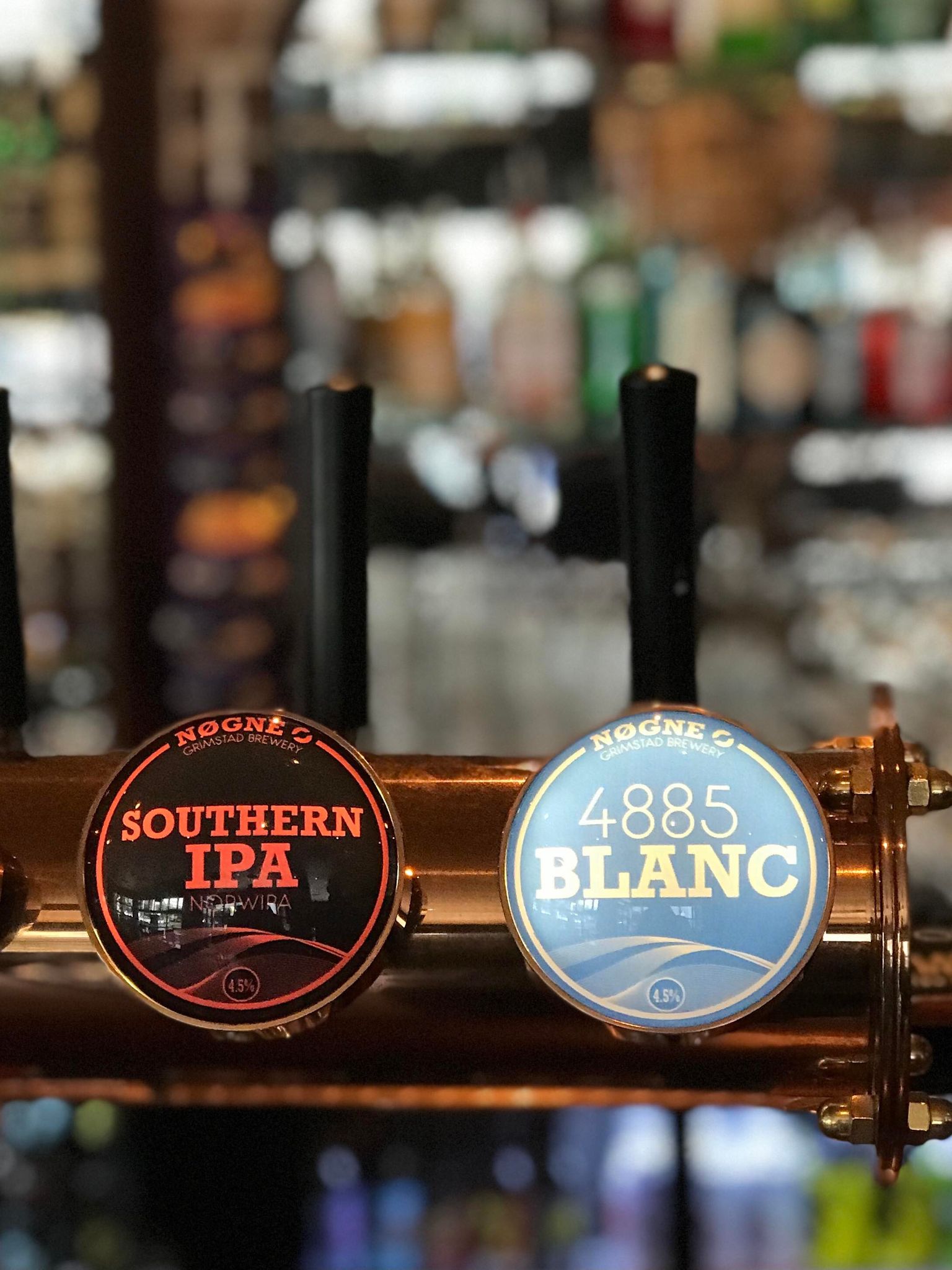
Cafe Dublin asked me to redesign the beer tap frog eyes which were originally focused on the breweries logo and the beer choices themselves were not the easiest to instantly see. So sticking with the breweries color profile and similar design aesthetic, I put more focus on the beer type but kept close to the […]
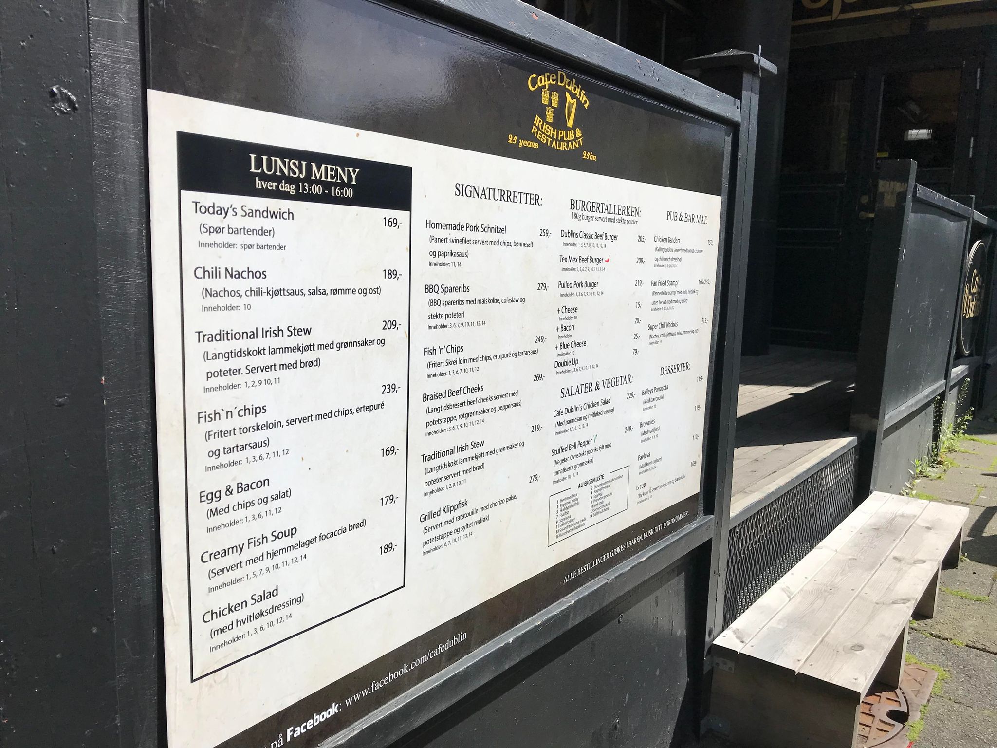
Cafe Dublin Irish Pub in Trondheim is a place I have a long work-relationship with and it is time for their menu to be updated meaning signs outside as well as menus inside. Laminated vinyl was printed and applied to the aluminium signs outside as well as no-tear paper used for the inside menus (for […]
Wrapping the last train at Marienborg for the new national train decor for SJ Norge and Signex AS and myself being freelanced by Neontex AS.I worked specifically between the windows and above as well as the doors and help with the logos/legal text.This 18 month job comes to an end, good times with good people.
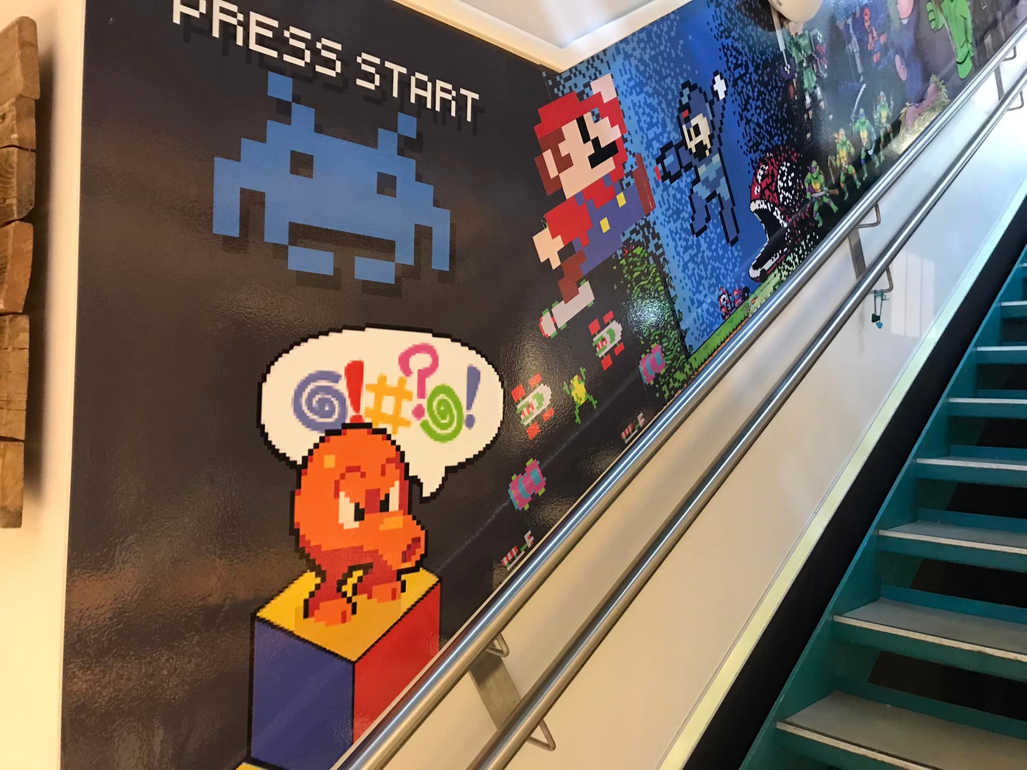
This was fun… a design for stair decor at Work-Work in Trondheim from ground floor to the games room downstairs. The idea being newer games at the top and as you go down you go through a history of gaming where they have clssic arcade games and pinball machines in the basement.The design was a […]
Here is hand painted overalls for a friends daughter who is a “Russ” this year. This design is specifically painted to be a little rough and hand-painted looking based on artwork she found online… almost in a graffiti style. This was painted using Amsterdam acrylics and some detailing with Posca markers. As the fabric was […]
I was asked by an associate of legendary boxer Mitch “Blood” Green to help design apparel for sale on his site and socials. It was not so easy to source high-quality images, there are surprisingly so few images available but using a mixture of a few I managed to recreate an iconic photograph of him, […]
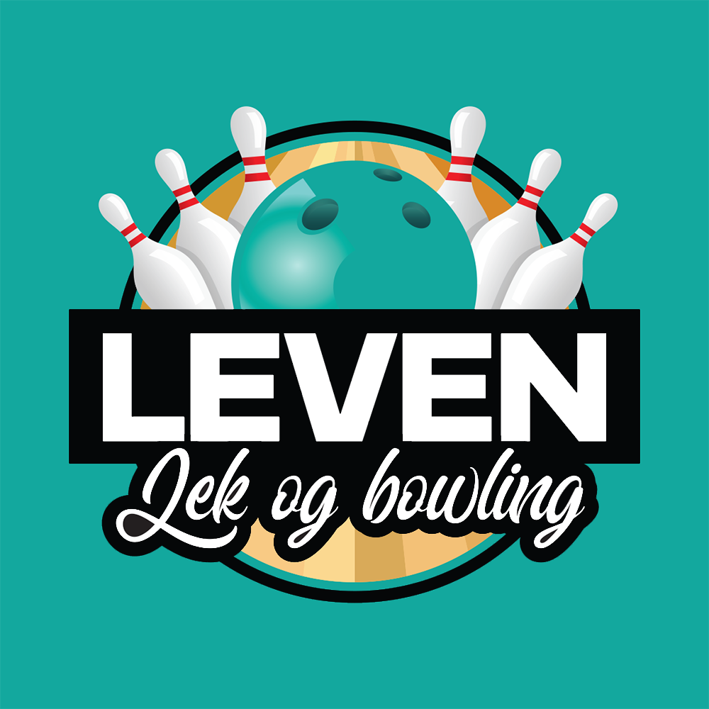
A new entertainment center in Brønnøysund is opening soon and I was asked to help them create a logo for it with bowling being the main focus. They also wanted specific coloring on the logo to match the interior design elements and potential clothing.
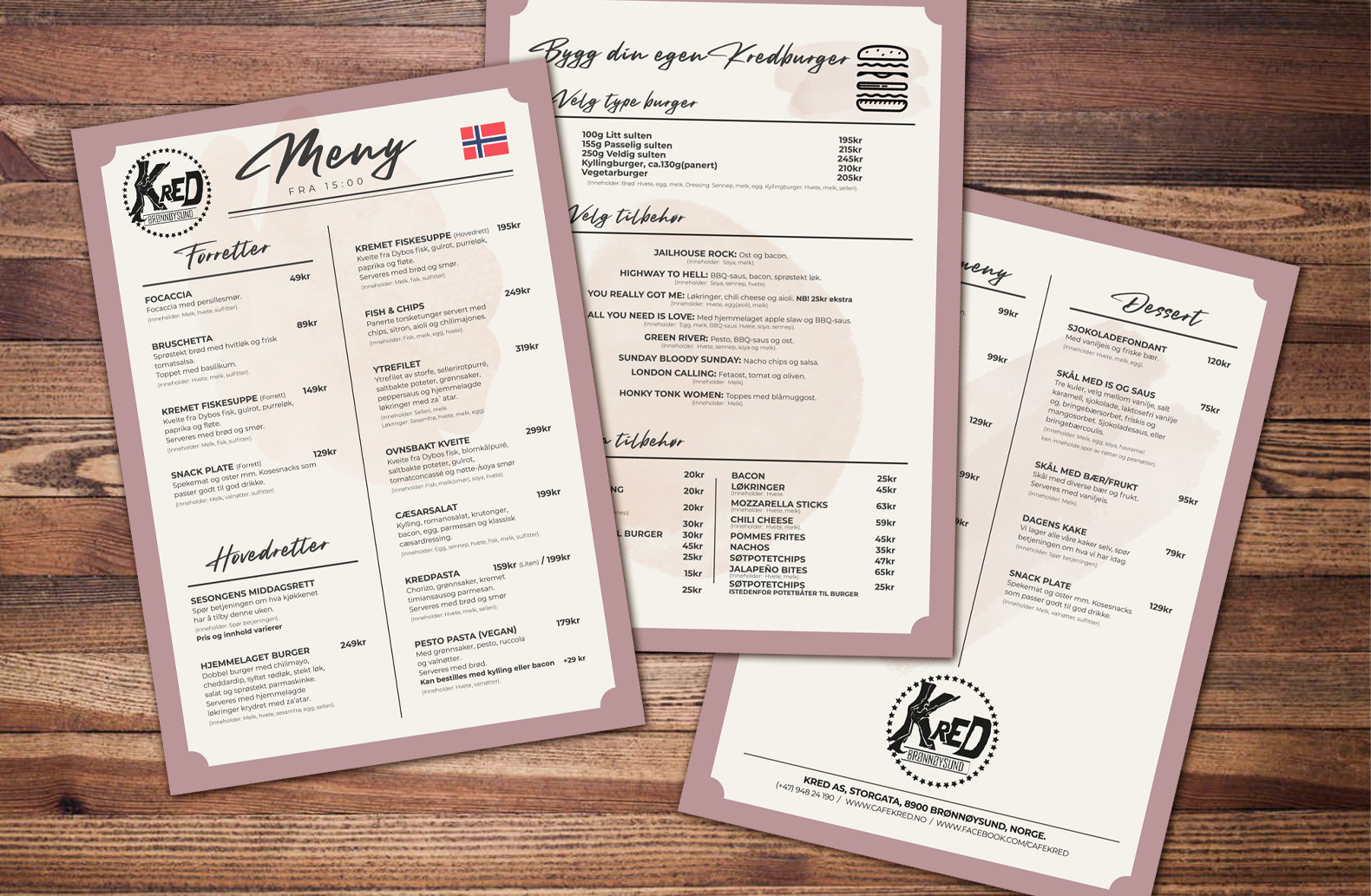
Kred (Brønnøysund) is a great Restaurant I also guest DJ at many times in the year, and this time i helped them re-design their menu (both main courses and lunch versions). We found a style they liked and then i reworked it to suit their branding.
A faceting effect livens up and interrupts the cubism that sets the morphology of the West system apart from the cliches of modern design. Characterised by its suitability for use in a wide range of different…

